
Master the Art of Living Room Gallery Walls
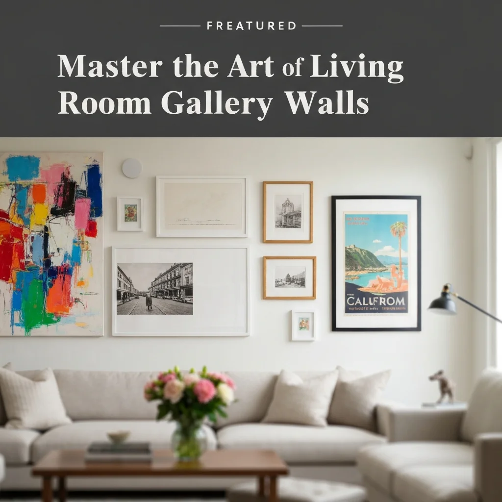
Walking into a living room with a thoughtfully curated gallery wall feels different. It’s personal, layered, and instantly draws the eye. But creating that look without it feeling chaotic or lopsided takes more than just hammering nails into the wall.
Whether you’re a first-time decorator or someone refreshing a tired space, mastering the art of living room gallery walls is a skill that pays off. Done right, it transforms a blank wall into the soul of the room. Here’s how to pull it off, step by step.
Why a Gallery Wall Works in a Living Room
The living room is where you unwind, host friends, and binge your favorite series. A gallery wall adds visual weight and personality without the need for bulky furniture. It softens the room, creates a focal point, and can even make a small space feel taller or wider.
Unlike a single large canvas, a gallery wall tells a story. You can mix family photos with vintage prints, children’s art with abstract pieces. Each item contributes to a layered narrative that reflects who lives there.
Start With a Strong Gallery Wall Layout
The number one mistake people make is winging it on the wall. A solid gallery wall layout prevents awkward gaps and crooked frames. The rule of thumb? Plan on the floor first. Arrange your frames on a large surface, playing with spacing and orientation until it clicks.
Use kraft paper or newspaper to trace each frame’s outline, then tape those templates to the wall. This trick lets you step back and adjust without committing to nail holes. It’s a game-changer, especially for large, multi-piece arrangements.
How to Nail Gallery Wall Spacing Every Time
Uniformity matters. Professional-looking gallery walls rely on consistent gallery wall spacing. Stick to 2 to 3 inches between frames. Too tight, and it feels cluttered. Too wide, and it looks disconnected.
If you’re mixing frame sizes, use the center of the arrangement as your anchor. Work outward, keeping that gap consistent. A quick tip: use a small level and a tape measure. Eyeballing it leads to tilted frames and uneven lines.
Mixing Frames, Art, and Objects Like a Pro
The magic of gallery walls lies in contrast. Combine different frame finishes—black, white, wood, or brass—for depth. Add in non-frame elements like a small mirror, a woven wall hanging, or a ceramic plate to break the pattern.
Here’s a simple mix that works every time:
- One large statement piece (a painting or oversized photo)
- Two medium prints (landscape or abstract)
- Three small photos or postcards
- One sculptural object (a small macrame or a floating shelf with a plant)
This formula gives balance without sameness. It’s the difference between a wall that looks assembled and one that looks designed.
Choosing the Right Wall and Scale
Not every wall is gallery-wall material. The best candidates are large, open surfaces without windows, doors, or architectural interruptions. Think above a sofa, behind a console table, or on an empty stairway wall.
Scale matters—a lot. Your gallery wall should fill about two-thirds to three-quarters of the available wall space. Too small, and it looks like an afterthought. Too large, and it overwhelms the furniture below it.
Lighting Your Gallery Wall for Maximum Impact
A gallery wall loses its charm when it’s poorly lit. Add a picture light above the main piece, or use track lighting directed toward the wall. If that’s not an option, a small clamp lamp on a nearby shelf does the trick.
Natural light is great, but direct sunlight can fade paper and photos. Use UV-protective glass for valuable prints. For evening warmth, consider warm-tone bulbs (2700K–3000K)—they flatter almost any artwork.
Gallery Wall Mistakes to Avoid
| Common Mistake | Why It Hurts the Wall | Better Approach |
|---|---|---|
| Inconsistent spacing | Creates visual chaos | Keep 2–3 inches between frames |
| Hanging too high | Feels disconnected from furniture | Center gallery at eye level (57–60 inches) |
| All one frame style | Looks flat and impersonal | Mix woods, metals, and mat colors |
| Skipping floor planning | Leads to uneven or off-center placement | Use paper templates first |
| Overcrowding | Makes room feel busy | Leave breathing room between clusters |
Avoid these pitfalls, and your wall will look intentional—not accidental.
FAQ: Your Gallery Wall Questions Answered
1. How many pieces should a living room gallery wall have?
There’s no magic number, but 5 to 9 pieces works for most standard walls. For larger walls, 12 to 15 pieces can look stunning if spaced well.
2. Should all frames match?
Not at all. Mixing styles—modern black frames with rustic wood or vintage brass—adds character. Just repeat a common color or finish to tie it together.
3. What’s the best height to hang a gallery wall?
Aim for the center of the arrangement at eye level, roughly 57 to 60 inches from the floor. If above a sofa, leave 6 to 8 inches between the top of the sofa and the bottom of the lowest frame.
4. Can I include non-art items like mirrors or shelves?
Yes, and you should. Mirrors add light and depth. Small shelves with plants or trinkets break the grid and make the wall feel dynamic.
5. How do I arrange frames for a small living room?
Stick to a tight, vertical layout. It draws the eye upward, making the ceiling feel higher. Use lighter frames and plenty of white space in the artwork to keep it airy.
6. What if I rent and can’t make many holes?
Use adhesive picture hanging strips for lightweight frames. For heavier pieces, use a few small nails—they’re easy to patch and paint over later.
7. Should I use mats in my frames?
Yes. Mats add breathing room between the art and the frame. They elevate the look and make even a simple print feel gallery-worthy. White or cream mats are safest.
8. How do I keep the gallery wall from feeling random?
Anchor it with one large, dominant piece. Everything else should complement it in color, tone, or subject. A cohesive color palette across your art helps unify the wall.
Your Go-To Checklist for Living Room Gallery Walls
Before you start hammering, run through this quick checklist:
- Choose a focal point (sofa, console, or fireplace wall)
- Measure the available wall space
- Select a mix of frames and art (include at least one non-frame item)
- Plan your layout on the floor or with paper templates
- Maintain consistent gallery wall spacing (2–3 inches)
- Hang at eye level or 6–8 inches above furniture
- Add target lighting for evening impact
Conclusion: Your Wall, Your Story
Building living room gallery walls doesn’t require an art degree or a huge budget. It requires patience, a little math, and a willingness to experiment. Start small, adjust as you go, and let the wall evolve over time.
The best gallery walls aren’t finished overnight. They grow with you—new prints from a trip, a child’s drawing, a flea market find. Each piece adds a layer of memory. So grab your level, trace your templates, and start creating a wall that truly feels like home.


