
How to Pick the Best Bedroom Color Palette
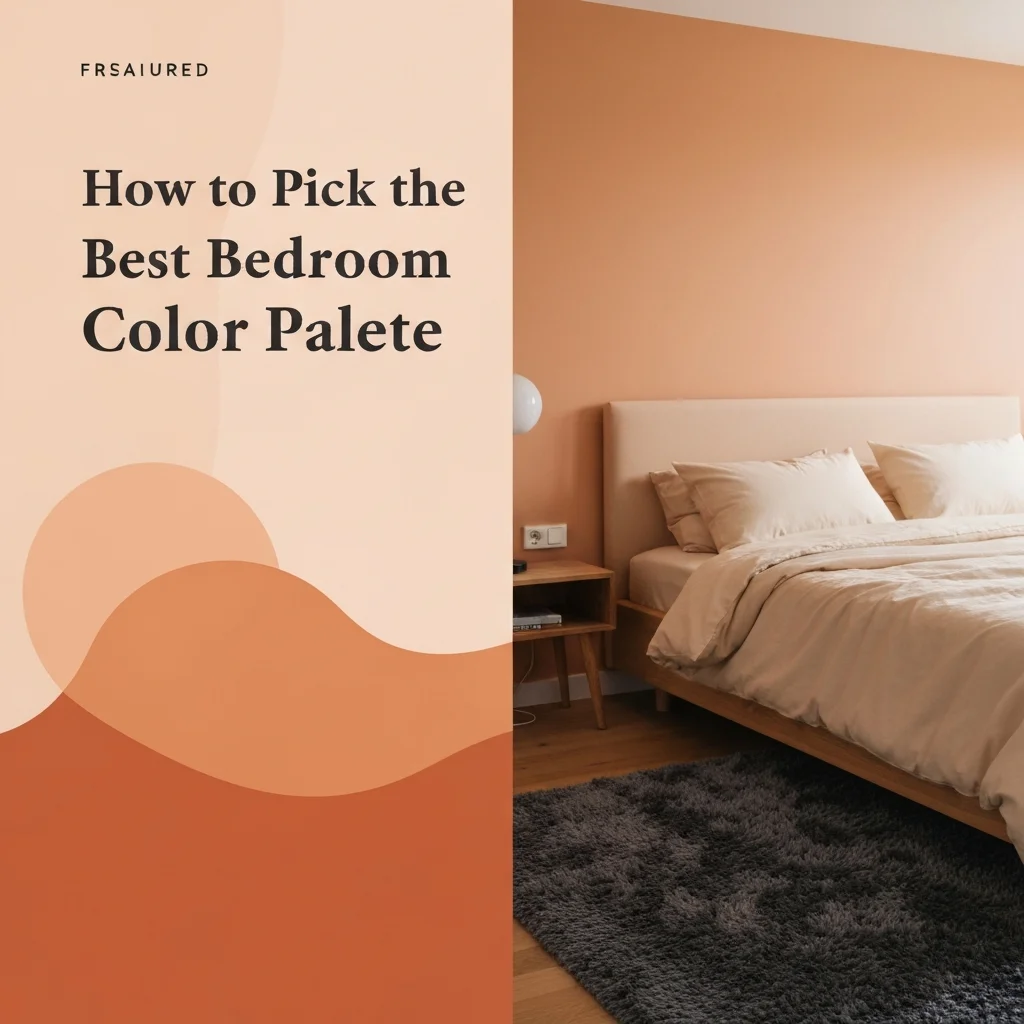
Choosing the best bedroom color palette is one of the most impactful decisions you can make for your home. The right colors do more than just look good—they set the mood, influence your sleep quality, and make the space feel truly yours.
Whether you’re refreshing a rental or renovating a master suite, this guide walks you through every step: from understanding color psychology to picking finishes that last. Let’s turn your bedroom into a personal sanctuary.
Why Color Psychology Matters in the Bedroom
Colors trigger emotional and physiological responses. Cool tones like blue and green lower heart rate and promote relaxation—ideal for sleeping. Warm tones like terracotta or blush add coziness but can feel stimulating if overused.
For a bedroom, you want a balance. Think of the bedroom paint colors as the backdrop for your daily wind-down ritual. Avoid high-saturation reds or bright yellows in large doses; they can increase anxiety over time.
Neutrals with a hint of undertone (like greige or warm white) offer flexibility. They let you change accent pillows or art without repainting your entire room.
Step 1: Define Your Bedroom’s Mood and Function
Before picking any swatch, ask yourself: How do I want to feel in this room? A calming bedroom scheme for deep sleep differs from a vibrant space used for getting ready or working from bed.
- Sanctuary vibe: Soft blues, sage greens, and lavender grays.
- Cozy retreat: Warm beiges, dusty rose, and clay.
- Modern minimalist: Crisp whites, charcoal, and one bold accent.
- Boho chic: Creams with earthy terracotta and ochre pops.
Write down your goal. This will guide every decision from paint sheen to rug tones.
Step 2: Consider Natural and Artificial Lighting
Light changes everything. A north-facing room gets cool, dim light—warm paint colors like peach or buttercream help balance it. South-facing rooms are bright and warm; cool grays or blue-greens prevent the space from feeling harsh.
Test samples on at least two walls and observe them at morning, noon, and night. Your master bedroom design palette should look harmonious under both sunlight and your bedside lamp.
Pro tip: Use a satin or eggshell finish on walls to reflect soft light. Avoid flat finish in low-light rooms—it can feel flat and drab.
Step 3: Use the 60-30-10 Rule for Balance
This classic design principle creates a cohesive palette. 60% is your dominant color (walls), 30% is your secondary color (upholstery, curtains), and 10% is your accent (throw pillows, art).
| Component | Example Palette A (Calm) | Example Palette B (Warm) |
|---|---|---|
| 60% (Walls) | Soft gray-blue | Warm beige |
| 30% (Furniture/Textiles) | White linen + light wood | Chocolate brown + cream |
| 10% (Accents) | Dusty coral + gold | Mustard yellow + teal |
Using this ratio prevents visual chaos. It also makes future updates easy—swap the 10% items for a whole new look without repainting.
Step 4: Tailor the Palette to Your Room Size
Small bedroom color ideas should focus on illusion. Light, airy hues like pale aqua or warm white make walls recede, creating a sense of space. Dark colors can work, but limit them to one accent wall or the ceiling.
For large master bedrooms, richer tones (navy, charcoal, or forest green) add intimacy. If your room is long and narrow, paint the shorter ends a darker shade to visually square it off.
Always consider ceiling color: white brightens, while a tone slightly darker than walls lowers the visual height for a cozy cave effect.
Step 5: Coordinate with Fixed Elements
Your existing flooring, headboard, and window treatments are non-negotiable. Pull a color from your rug or curtains to use as your wall base. This ensures the best bedroom color palette feels intentional, not accidental.
For example, if you have honey-oak floors, avoid cool grays that clash. Instead, choose warm greige or soft cream with a yellow undertone. If your headboard is a bold velvet, let it be the 30% color and paint walls a neutral that complements it.
Gather fabric swatches and floor samples before you buy paint. Match them under natural light to avoid costly mismatches.
Step 6: Test Before You Commit
Never paint a whole room based on a 2×2 swatch. Buy sample pots and paint large poster boards (approx. 2×3 feet). Move them around the room and live with them for a few days.
Look at the color when you’re tired, when the sun is setting, and when the lamp is on. A shade that looks perfect at noon might look flat or cold at night.
Digital tools help, but they can’t replace real-life perception. This small investment saves you from repainting expensive mistakes.
Frequently Asked Questions
What is the most relaxing color for a bedroom?
Soft blues and muted greens are widely considered the most relaxing. They mimic nature and lower stress levels. Avoid neon or high-saturation tones if relaxation is your main goal.
Can I use dark colors in a small bedroom?
Yes, but use them strategically. A dark accent wall behind the bed adds depth without closing in the room. Pair it with light furniture and plenty of mirrors to reflect light.
How many colors should a bedroom palette have?
Stick to three to five colors total, including neutrals and accents. The 60-30-10 rule keeps things cohesive. Too many competing colors can make the room feel restless.
Should I match my bedroom color to my furniture?
Not exactly—coordinate rather than match. Pull a subtle undertone from your wood or fabric, not the exact hue. This creates a designer look that feels layered.
What paint finish is best for bedroom walls?
Eggshell or satin is ideal. It offers a slight sheen that is forgiving of imperfections and easy to clean. Flat can work on ceilings or low-traffic accent walls.
How do I pick a palette if I share the room?
Choose a neutral base you both love, then each person picks one accent color. For example, a warm gray base with his navy and her blush in pillows and art. This balances compromise with personality.
Does the ceiling color matter?
Absolutely. A white ceiling brightens a room and makes it feel taller. Painting the ceiling a slightly lighter version of your wall color can create a cozy, wrapped effect.
Conclusion
Choosing the best bedroom color palette doesn’t have to be overwhelming. Start with the mood you want, consider your room’s light and size, and always test before painting. Use the 60-30-10 rule to keep things balanced, and coordinate with what you already own.
A well-chosen palette transforms a bedroom from a place you sleep into a retreat you love. Take your time, trust your instincts, and enjoy the process. Your perfect palette is out there—go find it.


