
The Best Bedroom Paint Colors for Relaxation
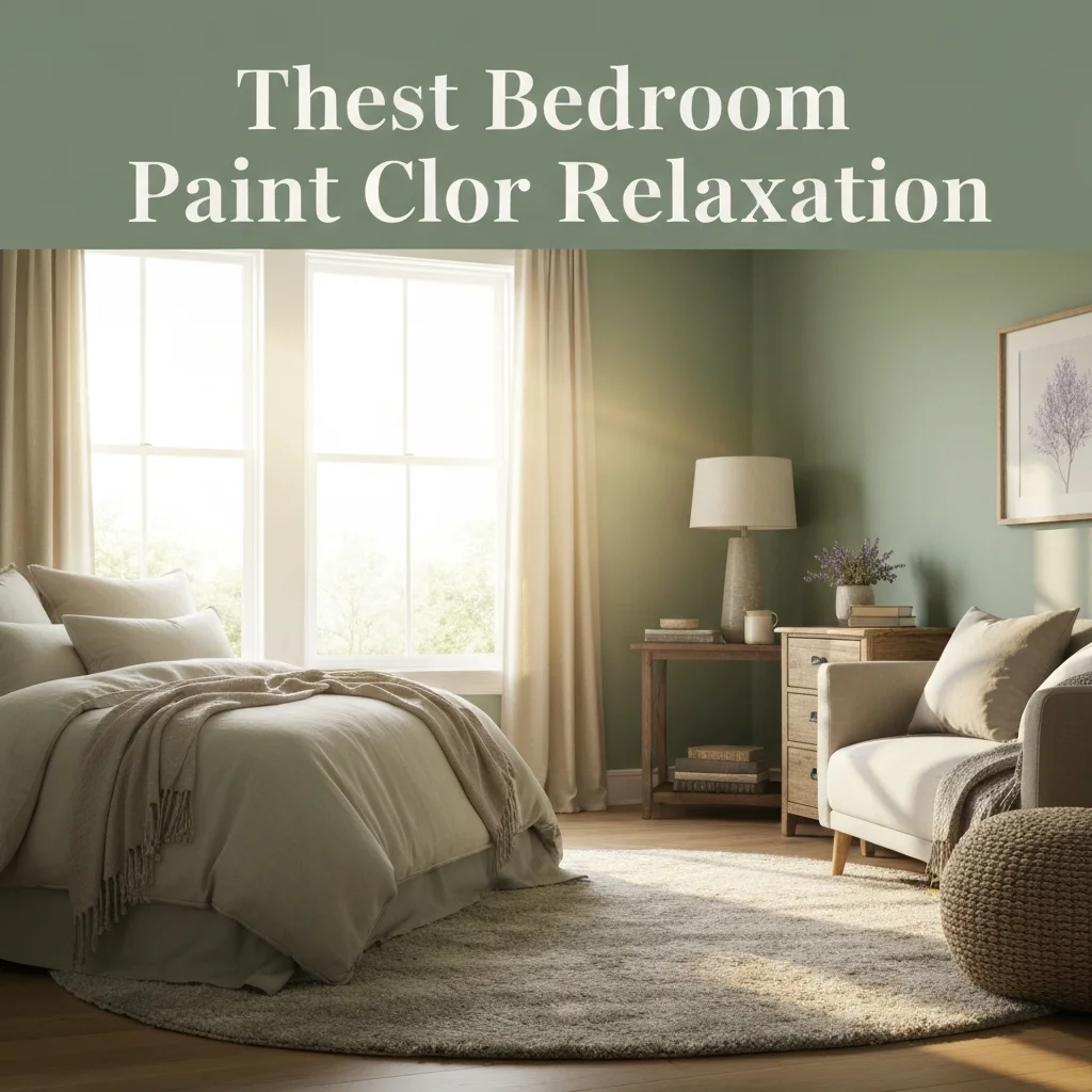
Your bedroom should be a retreat from the noise of daily life. But if your walls are painted a jarring red or a high-energy yellow, your brain might struggle to switch off at night. Choosing the right hue isn’t just about aesthetics — it’s about hacking your nervous system for better sleep.
After 15 years writing about home design, I’ve seen trends come and go. But one thing remains constant: the best bedroom paint colors for relaxation are those that mimic nature, soften light, and lower heart rate. In this guide, I’ll walk you through the most effective shades, backed by color psychology and real-world examples.
Why Color Matters in Your Bedroom
Color directly affects your circadian rhythm. Bright, stimulating tones like orange and electric blue tell your brain to stay alert. On the other hand, muted, cool hues signal safety and calm. A study from the University of Sussex found that people sleeping in blue bedrooms averaged nearly 7.5 hours of sleep per night — more than any other color group.
When you’re searching for calming bedroom paint ideas, focus on colors with low saturation and moderate lightness. These shades create a “cocoon effect” that makes the room feel intimate without being claustrophobic.
Cool Blues: The Ultimate Sleep Trigger
Blue is the undisputed champion of relaxation. Think of the sky at dusk or a still lake at dawn. Shades like powdery sky blue, slate, and deep navy are proven to lower blood pressure and slow breathing.
For a safe bet, go with Benjamin Moore’s “Arctic Blue” or Sherwin-Williams “Quietude.” These serene bedroom color schemes work beautifully when paired with crisp white trim and natural linen bedding.
Pro tip: avoid electric or cobalt blues. They are too stimulating. Stick to grayed-down or dusty variations for maximum tranquility.
Soft Greens: Nature’s Tranquilizer
Green sits in the middle of the color spectrum, which makes it the easiest hue for your eyes to process. It reminds us of forests and meadows — primeval safe spaces. Soft sage, moss green, or a pale celadon all qualify as relaxing paint colors for bedrooms.
Farrow & Ball’s “Green Smoke” is a popular choice, but don’t overlook Behr’s “Herbal Garden” for a budget-friendly option. Green also pairs exceptionally well with wood furniture and indoor plants, reinforcing the biophilic effect.
Warm Neutrals: Beige, Greige, and Warm Gray
Not everyone wants color on the wall. If your style leans minimalist, warm neutrals are your best friend. But avoid stark white — it can feel clinical and sterile, which disrupts sleep for some people.
Instead, choose a greige (gray + beige) like Sherwin-Williams “Agreeable Gray” or a creamy beige like Benjamin Moore “Manchester Tan.” These tones create a cozy, womb-like atmosphere.
Why this works: warm neutrals absorb light softly instead of reflecting it harshly. Your room feels enveloping, not stark. This makes them one of the best bedroom paint colors for relaxation if you prefer a neutral palette.
Dusty Lavenders and Blush Pinks
Don’t write off purple — at least not the muted versions. Bright purple is a no-go, but a dusty lavender or a soft blush pink brings warmth without overstimulation. These shades work especially well in north-facing rooms that need a subtle lift.
Try a color like Valspar “Lavender Gray” or Sherwin-Williams “Rose Colored Glasses” (applied lightly, not saturated). These hues are often overlooked in lists of serene bedroom color schemes, but they are surprisingly effective at easing anxiety.
Dark Accent Walls: Navy and Charcoal
If you have a large bedroom, don’t be afraid to go dark. Deep navy, charcoal, or even black can be incredibly calming — they absorb excess light and create a cave-like sense of security. The key is to use them strategically.
A single accent wall behind the bed is enough. Pair it with lighter surrounding walls and plenty of warm lighting (table lamps, not overheads). Benjamin Moore “Hale Navy” or “Chelsea Gray” are favorites among interior designers for bedroom wall color for sleep.
Just test the color in different lights before committing. Dark colors can feel oppressive in small rooms with no natural light.
Comparison Table: Best Paint Colors at a Glance
| Color Family | Top Paint Picks | Best For | Light Level |
|---|---|---|---|
| Blue | Benjamin Moore “Arctic Blue” | Deep sleep | Medium to low |
| Green | Sherwin-Williams “Quietude” | Anxiety reduction | Medium |
| Warm Neutral | Sherwin-Williams “Agreeable Gray” | Minimalist spaces | Bright to medium |
| Muted Purple | Valspar “Lavender Gray” | Small, dark rooms | Low |
| Dark | Benjamin Moore “Hale Navy” | Large bedrooms | Very low |
Colors to Avoid in the Bedroom
Some colors are scientifically proven to hinder relaxation. Here’s a quick list of what to skip:
- Bright red: Increases heart rate and is associated with danger or excitement.
- High-gloss yellow: Overstimulates the brain; can cause irritability.
- Pure white: Feels sterile and can be hard on the eyes at night.
- Neon or high-saturation hues: They demand attention, the opposite of rest.
If you love these colors in other rooms, keep them for your home office or living space — not where you need to wind down.
How to Test Paint Colors the Right Way
Never choose a paint color from a tiny swatch in the store. Lighting changes everything. Buy sample pots and paint large squares (at least 2×2 feet) on your wall. Observe them at three times of day: morning, afternoon, and evening with lamps on.
Pro tip: pay attention to the undertones of your chosen color. A gray might pull purple or green depending on the brand. This can ruin your carefully curated calming bedroom paint ideas if not checked in advance.
FAQ: Bedroom Paint Colors for Relaxation
1. What is the most relaxing color for a bedroom?
Soft blue, particularly dusty sky blue or slate, is widely considered the most relaxing. It lowers heart rate and promotes melatonin production.
2. Is gray a good color for a bedroom?
Yes, but avoid cool gray with blue undertones. Choose a warm greige or a gray with beige undertones for a cozier, more sleep-friendly atmosphere.
3. Should I paint the ceiling a different color?
Painting the ceiling a shade lighter than the walls can make the room feel taller and more airy. For small bedrooms, keeping it white is safest.
4. Can I use dark colors in a small bedroom?
Yes, but use them sparingly. A dark accent wall on the longest wall can add depth without shrinking the room visually. Use mirrors to bounce light around.
5. What sheen should I use for bedroom walls?
Matte or eggshell sheen is ideal. They absorb light and hide imperfections, which reinforces a calm, soft ambiance. Avoid satin or semi-gloss outside of trims.
6. Does paint actually affect sleep quality?
Yes. Color psychology and ambient light reflection both play roles. Darker, muted colors reduce visual stimulation, making it easier for your brain to transition into sleep mode.
7. How often should I repaint my bedroom?
Every 3-5 years, or whenever you notice fading, chipping, or simply feel bored. A fresh coat in a calming hue can instantly improve your mood.
8. What is the best paint brand for bedrooms?
Benjamin Moore and Sherwin-Williams offer the best color depth and durability for bedrooms. For budget options, Behr and Valspar are excellent alternatives.
Conclusion
Your bedroom should be the easiest room in your home to relax in. By choosing from the best bedroom paint colors for relaxation — whether it’s a soothing blue, a grounding green, or a warm neutral — you set the stage for deeper, more restorative sleep.
Remember to test your samples, pay attention to undertones, and always consider how light behaves in your specific room. A little extra effort at the paint store pays off in countless nights of peaceful rest. Now go pick up that brush and start creating your personal sanctuary.


