
The Best Colors for a Calming Bedroom
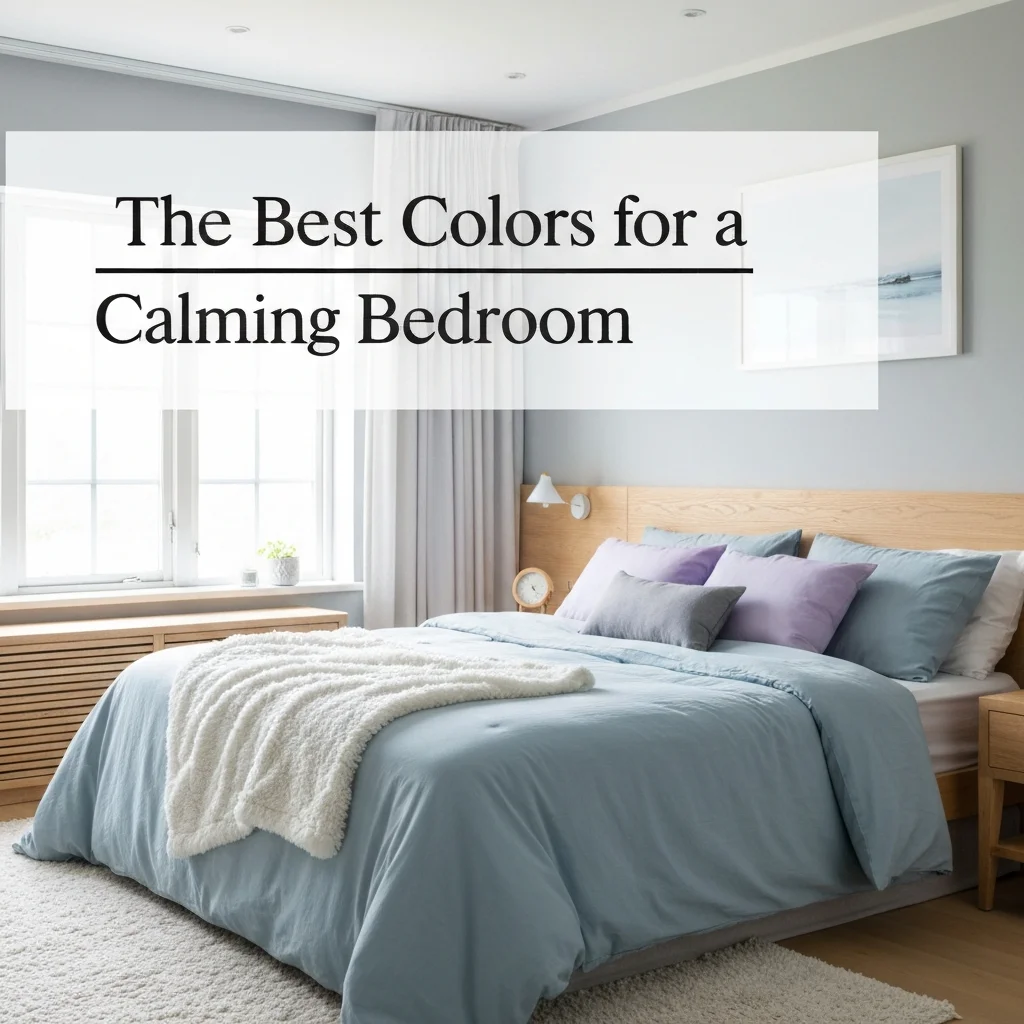
Your bedroom should be your personal sanctuary—a place where stress melts away and sleep comes easily. Yet, the wrong paint color can keep your brain buzzing long after you hit the pillow. Choosing the best colors for a calming bedroom is more than just a design choice; it’s science-backed self-care.
Color psychology shows that certain hues lower blood pressure, slow your heart rate, and signal your brain that it’s time to rest. Whether you prefer minimalist neutrals or want to dip into moody blues, I have tested and curated the most effective shades after a decade of designing sleep-focused rooms. Let’s dive into the palette that will actually help you wake up refreshed.
Why Color Matters in Your Bedroom Design
Think of color like an invisible thermostat for your emotions. Bright reds and vibrant oranges raise energy and alertness—great for a gym, terrible for sleep. Cool, muted tones, on the other hand, reduce anxiety and evoke feelings of safety and peace. When you choose a bedroom color palette for relaxation, you’re using visual cues to tell your brain: “It’s time to slow down.”
Neuroscience confirms that blue light from screens disrupts melatonin, but what about blue paint? The right tone of dusty blue or soft teal actually calms the nervous system. This is why hospital recovery rooms often use pale shades of aqua or sage. You don’t need to live in a clinical space, but you can borrow their logic for your serene bedroom decor ideas.
1. Soft Blue: The Gold Standard for Sleep
If you only paint one wall with a relaxing color, make it soft blue. This hue tops every list of soothing paint colors for sleep. Light blues mimic the sky and water—elements that humans naturally associate with safety and openness. A typical shade like Benjamin Moore’s “Pale Smoke” or Sherwin-Williams “Rainwashed” works wonders.
Pro tip: avoid bright or electric blues. They bounce too much light and can feel cold. Stick to muted, grayed-down versions. If you have a small bedroom, use soft blue on all four walls. You will physically feel your shoulders drop when you walk in. Combine it with white linen and natural wood for a truly restorative vibe.
2. Dusty Green: Bring Nature Inside
Green is the color of life and growth, but a calming bedroom demands muted, dusty versions—never neon or lime. Think sage, moss, or olive tones. These shades connect you to the natural world, even if you live in a city high-rise. Farrow & Ball’s “Card Room Green” is a cult favorite among interior designers for a reason.
Dusty green works beautifully in bedrooms with lots of plants or wooden furniture. It creates a grounding effect that reduces visual noise. If you want to try a bedroom color palette for relaxation without a full commitment, paint just the ceiling or an accent wall behind the headboard. You will get all the calm without overwhelming the space.
3. Warm Neutrals: Beige, Greige, and Soft Gray
Many people mistake “neutral” for boring, but the right warm neutral is anything but. Pure white can feel sterile and cold, which actually disrupts relaxation. Instead, choose a greige (gray + beige) with warm undertones. Colors like Accessible Beige by Sherwin-Williams or Pale Oak by Benjamin Moore create a cozy, cocoon-like environment.
Warm neutrals are the most versatile for calming bedroom design tips because they work with any decor style. Pair them with layers of texture: chunky knit throws, velvet pillows, and linen curtains. The key is to avoid high contrast. You want the walls, bedding, and furnishings to blend softly, creating a visual hug around you as you sleep.
4. Soft Lavender and Muted Purple
Lavender might sound old-fashioned, but modern muted purples are trending for a reason. They combine the stability of blue with the warmth of red, creating a balanced and spiritual atmosphere. Light shades like “Lilac White” or “Dusted Lavender” help quiet a busy mind, making them excellent choices for anxious sleepers.
Warning: keep the purple very pale. Deep or vivid purples can feel heavy or even moody in a negative way. Pair soft lavender with plenty of white trim and gold or brass accents. This creates just enough visual interest without waking up your nervous system. It’s an unexpected yet deeply relaxing choice for those seeking unique serene bedroom decor ideas.
5. Earthy Terracotta and Blush Pink
Warm earth tones like terracotta, blush, and clay bring a subtle, grounded energy to your bedroom. Unlike bright pinks that feel youthful or bold, muted blush and clay shades feel mature and comforting. They trigger feelings of warmth and safety—like being wrapped in a soft blanket. Try “Coral Clay” by Behr for a beautiful example.
These colors are perfect for bedrooms that get a lot of natural light. The warm tones glow without being harsh. Use them on an accent wall or on the lower half of a wall with a chair rail. You can also use these shades in textiles, like a terracotta-colored duvet cover or blush pillows, if painting feels too bold.
How to Test and Combine Your Perfect Palette
Never rely on paint chips alone. Lighting changes everything. Buy large samples (not the tiny squares) and paint a 2×2 foot area on your wall. Live with it for at least 48 hours. Observe it in morning light, harsh afternoon sun, and warm lamp light. What looks calming at noon may feel dull or cold at night.
When combining colors, use the 60-30-10 rule: 60% of the room in a dominant calming color (walls), 30% in a secondary neutral (bedding, curtains), and 10% in an accent (pillows, art). This creates balance without visual chaos. Below is a quick reference table for your perfect palette:
| Base Mood | Best Color Family | Paint Example | Complementary Decor |
|---|---|---|---|
| Airy & Open | Soft Blue | Sherwin-Williams Rainwashed | White linen, natural wood |
| Grounded & Natural | Dusty Green | Farrow & Ball Card Room Green | Potted plants, rattan furniture |
| Cozy & Warm | Greige / Warm Neutral | Sherwin-Williams Accessible Beige | Velvet pillows, chunky knits |
| Gentle & Calm | Soft Lavender | Benjamin Moore Lilac White | White trim, gold accents |
| Earthy & Safe | Muted Blush / Terracotta | Behr Coral Clay | Linen curtains, cream bedding |
Colors to Avoid in a Sleep Sanctuary
Not all colors are created equal for a calming bedroom. Some hues are scientifically proven to keep your brain alert. Avoid these if better sleep is your goal:
- Bright Red or Orange: They raise heart rate and energy levels. Save them for a home gym or dining room.
- Dark Black: While it sounds cozy, pure black can feel oppressive and increase anxiety for many people.
- Vibrant Yellow: Cheerful in a kitchen, but too stimulating for sleep. Muted mustard is okay in small doses.
- High-Gloss Finishes: Even a calm color in a shiny finish can create glare and visual buzz. Always use matte or eggshell.
Remember that texture also plays a role. A calm color on a flat, matte wall feels more peaceful than the same color on a shiny surface. If you love a particular intense color, use it in small accessories—not the walls.
Final Touches to Complete Your Relaxing Atmosphere
Once you choose the best colors for a calming bedroom, the work isn’t done. The paint is the canvas, but the decor is the brushstroke. Keep your lighting soft and layered—no overhead boob lights. Use dimmable lamps with warm bulbs (2700K to 3000K) to match the cozy feeling of your palette.
Minimize clutter: a calm color calms the brain, but piles of stuff create visual stress. Invest in simple storage baskets and keep your surfaces clear. Finally, add soft textiles in your chosen color scheme. A calm bedroom is a sensory experience—sight, touch, and smell all working together. A lavender scent diffuser or a linen spray in a complementary fragrance can seal the deal.
Frequently Asked Questions (FAQ)
What is the most relaxing color for a bedroom?
Soft blue is widely considered the most relaxing color for sleep. It lowers heart rate and blood pressure, mimicking the calming effects of the sky and water. Muted greens and warm neutrals are close seconds.
Is gray a good color for a calming bedroom?
Yes, but only if it has warm undertones. Cool grays can feel sterile and cold. Choose a greige (gray-beige) or a warm gray like Sherwin-Williams “Agreeable Gray” for the most peaceful effect.
Can I use dark colors in a small bedroom?
Absolutely, but stick to dark muted tones like midnight blue or deep forest green. Deep colors can actually make a room feel cozy and cocoon-like. Use them on one accent wall or high-gloss trim, and keep the rest light.
What is the worst color for sleep?
Bright red and vibrant orange are the worst choices. They are highly stimulating and increase energy levels, making it difficult to wind down. Save them for social or active spaces.
Should I paint my ceiling a calming color too?
Yes! Painting the ceiling a lighter version of your wall color creates a seamless, enveloping effect. Avoid pure white ceilings—they create a harsh contrast that can disrupt the calm flow.
How do I choose between matte and eggshell finish?
Matte finish is best for hiding imperfections and creating a soft, non-reflective surface—ideal for calming bedrooms. Eggshell is slightly more durable and easier to clean, but it does reflect a bit more light.
What color makes you feel safe and secure while sleeping?
Earthy tones like terracotta, clay, and muted blush pink trigger feelings of safety and warmth. They mimic the colors of our natural ancestral homes: caves, earth, and sunsets.
Conclusion: Your Calm Bedroom Starts with One Coat
Transforming your sleep space doesn’t require an expensive renovation. Simply choosing the best colors for a calming bedroom can dramatically improve how you feel every single night. Whether you fall for dusty blue, warm greige, or soft lavender, the key is choosing muted, low-saturation tones that whisper instead of shout.
Start small—paint one accent wall or just the ceiling if a full room repaint feels daunting. Pair the color with soft, warm lighting and natural textures. Within days, you will notice that you fall asleep faster, wake up less, and feel more rested. Your bedroom is your most personal room in the house. Make it your retreat, not a storage unit. A few gallons of the right paint can change your entire life.


