
Living Room Color Palettes That Never Go Out of Style
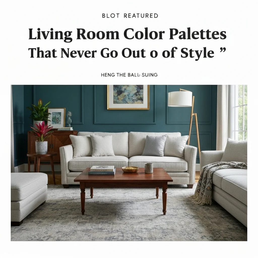
Choosing the right paint color for your living room is a big decision. You want a space that feels fresh, inviting, and personal—but you also don’t want to repaint every two years because a trend fades. That’s where living room color palettes that never go out of style come in.
These aren’t just safe choices. They are foundational colors that allow you to update your decor without touching the walls. Think of them as your design backbone. In this guide, I’ll walk you through the most enduring palettes I’ve seen work in homes for decades.
Why Some Colors Stand the Test of Time
Trendy colors often have a short shelf life. Remember when “millennial pink” was everywhere? Or the deep charcoal craze of 2018? While beautiful, these shades can feel dated once the trend cycle moves on.
Timeless colors share specific traits. They are usually grounded in nature, have balanced undertones, and work with a variety of furniture styles. Neutral bases, soft earth tones, and classic jewel tones have staying power because they connect with our innate sense of comfort and balance.
When choosing a palette, look beyond what’s popular on Pinterest. Ask yourself: “Will I love this color in five years?” If the answer is yes, you’ve found a winner.
Warm Neutrals: The Ultimate Foundation
Warm neutrals like creamy white, beige, and greige are the backbone of timeless design. They don’t shout for attention, but they create a calm, sophisticated backdrop. Think of a soft off-white with a hint of yellow, or a greige that leans slightly warmer than true gray.
One of my favorite examples is Benjamin Moore’s “White Dove.” It’s not stark or cold. It feels like sunlight on a cloudy day. Pair it with natural wood furniture, linen curtains, and a few green plants for a look that feels both fresh and grounded.
Warm neutrals are also forgiving. They hide dust and minor scuffs better than dark shades, and they reflect light beautifully. If you want a room that feels larger and airier, this is your go-to.
Soft Blues: Calm and Collected
Blue is the most popular color in the world for a reason. Soft blues—think powder blue, duck egg, or slate—bring a sense of tranquility that works year-round. Unlike bright navy or electric blue, these softer versions feel serene and timeless.
I’ve used Farrow & Ball’s “Pigeon” in dozens of projects. It’s a blue-gray that shifts in different light, looking almost greenish in warm evening light. It pairs beautifully with white trim, brass accents, and warm taupe upholstery.
Soft blue living rooms also pair well with natural textures like jute rugs, wool throws, and cotton slipcovers. It’s a color that never feels cold, especially when balanced with warm metals and wood tones.
Earthy Greens: Bringing the Outdoors In
Green is having a serious moment, but unlike some trends, it has deep roots in classic design. Sage green, olive, and mossy tones have been used in English country houses for centuries. They connect us to nature and create a restful atmosphere.
A soft sage like Sherwin-Williams’ “Sea Salt” is a perennial favorite. It shifts between green and blue depending on the light, and it works with almost every accent color—coral, mustard, navy, or even black and white.
For a deeper, more dramatic take, consider a warm olive. It adds depth without feeling heavy. Pair it with cream-colored sofas and wooden side tables for a look that feels both modern and historical.
Classic White and Black Accents
You might think white is boring, but a crisp white living room done right is anything but. The key is choosing a white with subtle warmth—like Behr’s “Coconut Milk”—and layering in black accents for contrast.
Think black picture frames, a sleek black coffee table, or a black-framed mirror. The high contrast of white walls with black accents creates a clean, sophisticated look that never ages. Add texture through a chunky knit throw, a sisal rug, and plenty of greenery.
This palette is especially effective in small spaces. The white makes the room feel open, while the black anchors it and adds weight. It’s minimal without being sterile.
Greige and Mushroom: The New Neutrals
Greige—a blend of gray and beige—has perfectly balanced undertones. It’s cooler than beige but warmer than gray, making it a true neutral that works with any decor style. Sherwin-Williams’ “Agreeable Gray” is a top seller for good reason.
Mushroom tones, like a warm taupe or dusty brown, are also rising as timeless options. They add richness without going dark. I’ve seen a mushroom-toned living room paired with dusty rose pillows and aged brass fixtures—gorgeous and timeless.
These colors are fantastic if you love to switch up your accent colors seasonally. In summer, add bright blues and whites. In winter, bring in deep burgundies and golds. The wall color stays the same, but the room feels fresh.
How to Choose the Right Palette for Your Home
Before you pick up a paintbrush, consider your natural light. North-facing rooms benefit from warm tones. South-facing rooms can handle cooler shades. Test your top three colors on the wall and live with them for a few days—artificial light changes everything.
Another tip: look at your largest piece of furniture. If you have a beige sofa, a warm neutral on the walls will help it feel cohesive. If your sofa is gray, a greige or blue-gray might be better. The goal is harmony, not contrast overload.
Finally, don’t ignore the ceiling. Painting it a slightly lighter shade of your wall color (or a pure white) lifts the room. A white ceiling also makes the walls feel defined and intentional.
Table: Quick Reference of Timeless Living Room Palettes
| Palette Type | Example Color | Best For | Undertone |
|---|---|---|---|
| Warm Neutral | White Dove (BM) | Small, dark rooms | Warm yellow |
| Soft Blue | Pigeon (F&B) | Calm, serene spaces | Blue-gray |
| Earthy Green | Sea Salt (SW) | Nature-inspired homes | Green-blue |
| Classic White | Coconut Milk (Behr) | Minimalist decor | Warm cream |
| Greige | Agreeable Gray (SW) | Versatile, any style | Gray-beige |
| Mushroom | Accessible Beige (SW) | Rich, cozy rooms | Warm brown |
Key Elements That Make a Palette Last
- Balance of warm and cool: A palette that leans entirely cool can feel sterile. Mix in warm wood, brass, or cream to soften it.
- High-quality paint: Flat finishes hide imperfections but are harder to clean. Eggshell or satin works best for living room walls.
- Neutral anchor: Always include a neutral base (white, beige, or gray) to ground bolder accent colors.
- Texture variety: Same color in different textures—like a velvet pillow next to a linen sofa—adds depth without adding color.
- Natural light consideration: Always test colors in your specific lighting before committing.
Frequently Asked Questions
What is the most timeless color for a living room wall?
Warm white is the most timeless choice. It works with any decor style, reflects light beautifully, and can be updated with new accessories without repainting.
Can I use dark colors in a small living room without it feeling cramped?
Yes, but do it strategically. Use a dark accent wall behind a sofa or fireplace, and keep the other walls light. Deep navy or charcoal can actually make a room feel cozy and intimate.
How often should I repaint my living room with a timeless color?
With a timeless palette, you can go 7-10 years between repaints if you maintain the walls. Touch up scuffs and marks as needed.
Are gray living rooms still in style?
Cool grays are fading, but warm greiges are here to stay. The key is choosing a gray with some warmth in its undertones, not a blue-based or stark gray.
What accent colors work best with neutral living room palettes?
Navy, blush pink, soft coral, and forest green all pair beautifully with neutrals. Metallics like brass and copper add a touch of elegance.
Should I paint my ceiling white or match the wall color?
A white ceiling is almost always the safest bet. It lifts the room and makes walls appear taller. Only match ceiling and wall color in very small, cozy spaces.
Can I mix multiple timeless palettes in one open-plan space?
Absolutely. Use a consistent neutral base—like warm white walls throughout—and let the palette shift with accents and furniture zones. Living room area can lean soft blue, while dining area uses earthy green.
Do timeless colors work with modern furniture?
Yes, timeless colors like greige, warm white, and sage green are incredibly flexible. They complement both mid-century modern and contemporary furniture equally well.
Final Thoughts
Creating a living room that feels both current and lasting isn’t about following trends. It’s about choosing colors that resonate with your personal style and work with your home’s architecture. Living room color palettes that never go out of style are rooted in nature, balanced in tone, and versatile enough to adapt as your tastes evolve.
Start with a neutral base, add a soft blue or earthy green if you want a hint of color, and always test samples on your walls. Your living room is the heart of your home. Give it a foundation that will last for years to come.
If you’re feeling stuck, go back to the table above. Pick one palette that feels right for your light and lifestyle. You really can’t go wrong with any of these classic choices.


